
How to Change Your Store's Theme and Colours
Everything about how your store looks is on one screen: Content → Themes in your admin panel. This article walks through each option in the order it appears, with a screenshot of each step.
1. Admin panel appearance
The thin bar at the top switches your admin panel between Light, Dark and System (follows your computer). It only changes how the admin panel looks on the device you are using. Your customers never see it.
2. Home page theme
This is the design visitors see on your public home page. Each card has three buttons:
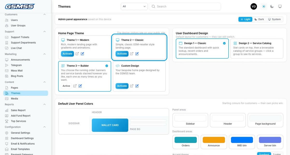
- Activate — makes that design live straight away.
- Preview (the arrow icon) — opens the design in a new tab so you can look before switching.
- Edit (the pencil icon) — opens the editor for that design's text, pictures and services.
The designs:
- Theme 1 — Modern: a full landing page with gradients and animations.
- Theme 2 — Classic: a simple, classic GSM-reseller style home page.
- Theme 3 — Builder: you choose the running order — banners and bands of service tiles, stacked however you like, as many times as you want.
- Custom Design: a bespoke home page built for you by the GSMSS team. Contact us if you want one.
Switching is safe: each theme keeps its own content, so you can switch back later without losing anything.
3. Editing the Builder (Theme 3)
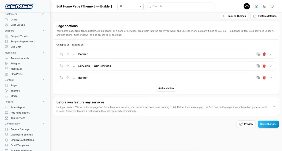
Click the pencil on Theme 3 — Builder. Each block in the list is one section of your home page, top to bottom.
- Use the arrows (or drag) to change the order of sections.
- Click a section to open it and change its heading, text, pictures or the services it shows.
- Click Add a section and choose Banner (a picture slider) or Services (a band of service tiles).
- Click Save Changes. Use Preview to check it before visitors do.
A services section only shows services where Show on home page is switched on (open the service under Services → IMEI Services). You can also give each service its own storefront picture there.
4. User dashboard design
This is what customers see after they log in. Design 1 — Classic has quick order lookup, recent orders and announcements. Design 2 — Service Catalog puts statistic cards on top and a browsable catalogue of your service groups underneath. Click one to make it the default; customers can still switch for themselves.
5. Default user panel colours
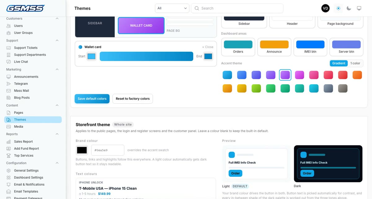
The starting colours of the customer dashboard. Customers who pick their own colours keep theirs.
- Click an area in the small preview — Sidebar, Header, Page background or Wallet card — or one of the buttons underneath (Orders, Announce, IMEI button, Server button).
- Pick a swatch, or type any hex colour. The preview updates as you go. Dark sidebar or header colours switch the menu text to light automatically.
- Choose an Accent theme — it colours the wallet card and the buttons. Gradient or 1 color changes the style.
- Click Save default colors. Reset to factory colors undoes everything in this box.
6. Storefront theme (the whole site)
These settings apply everywhere: the public pages, the login and register screens and the customer panel.
- Brand colour — one colour for buttons, links and highlights on every page. A light colour automatically gets dark button text so it stays readable.
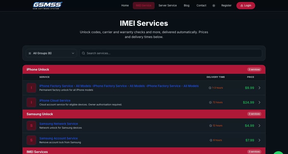
- Text colours — choose your own colour for Price, Service name, Delivery time, Description and Group heading. The sample card above the list shows exactly how they will look. Leave a colour blank (or click Use default) to keep the normal colour.
- Opens in — whether a first-time visitor sees your store in Light or Dark mode. Visitors can still flip it with the sun/moon button, and their choice is remembered.
- Dark mode palette — ready-made sets of greys (Slate, Midnight, Cyberpunk HUD, Warm Charcoal) or Custom to pick your own three tones. The preview shows light and dark side by side.
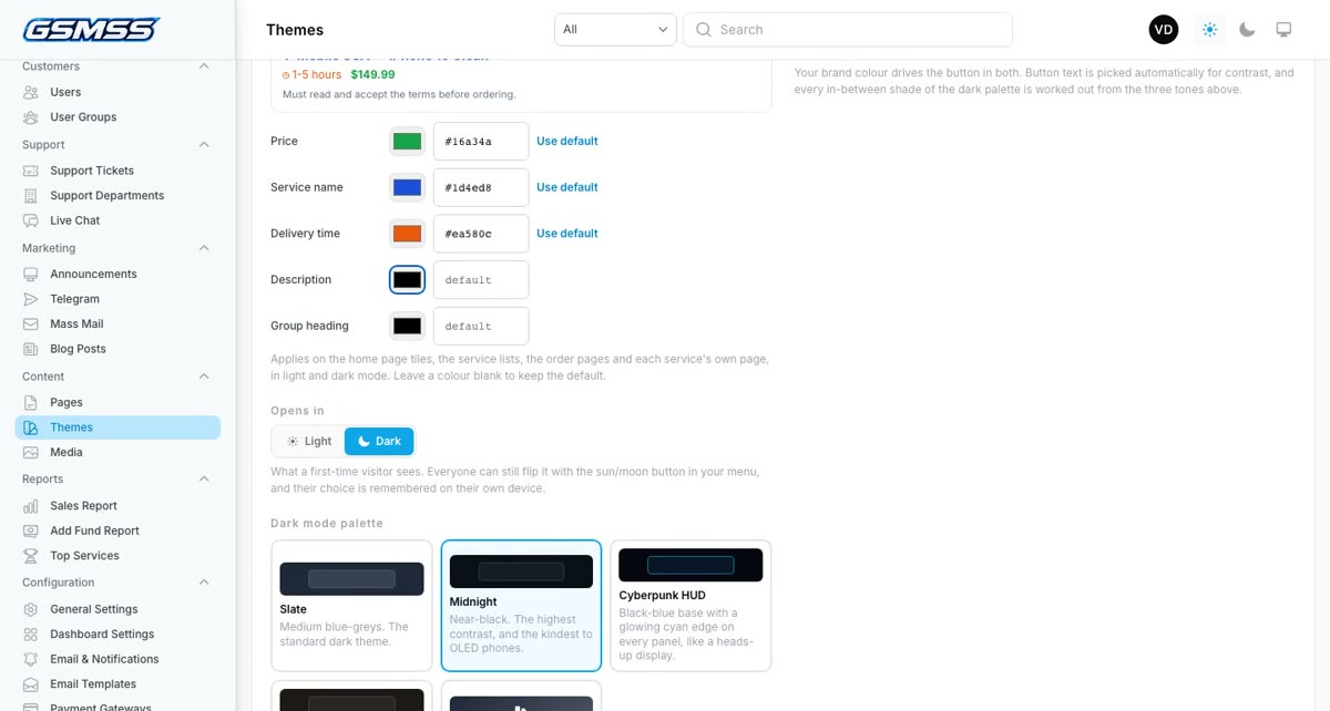
Click Save storefront theme when you are happy. Reset to defaults puts this whole section back to the standard look.
Tips
- Check your colours in both light and dark mode — open your store and press the sun/moon button in the menu.
- Pick text colours that stand out from your brand colour. Group headings, for example, sit on a brand-coloured bar on the public price list, so a group colour close to your brand colour will be hard to read.
- If something looks wrong, Reset to defaults is always one click away.
For every other part of the admin panel, see the full GSMSS admin panel guide. Questions? Message us on Telegram @gsmsoftwaresystem.
Ready to launch your own GSM store?
Get the complete GSMSS platform — order management, dashboards, wallet, API integrations and more.